Nabisco Wheat Thins Redesign
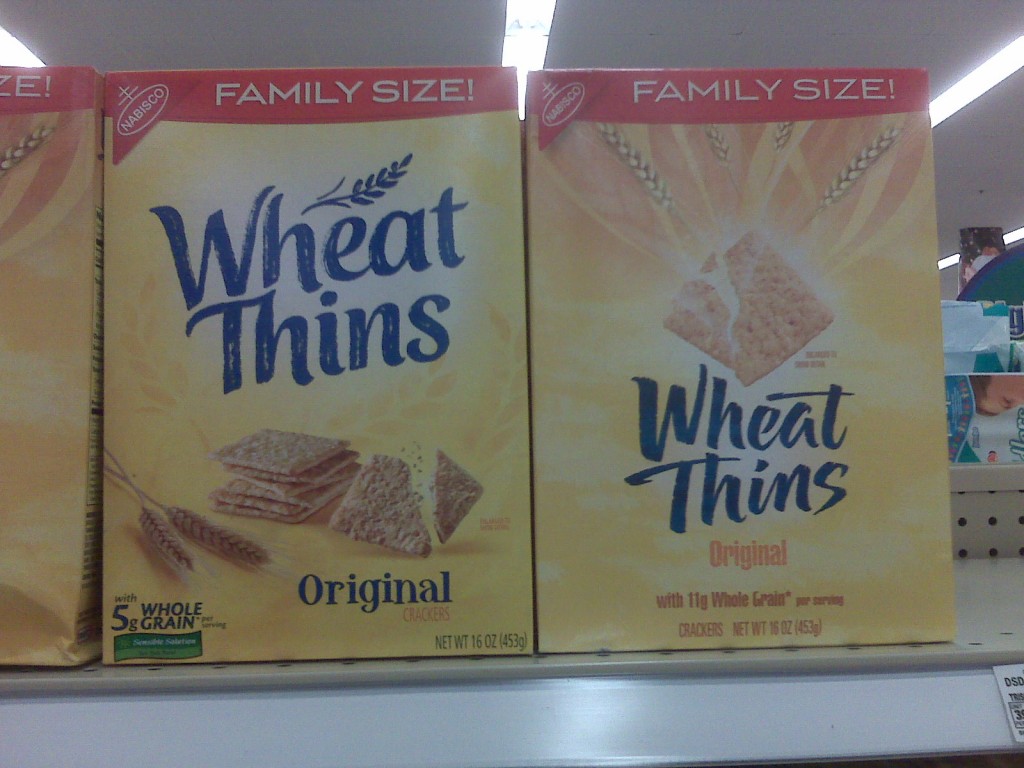
 As I walked down the cracker aisle of my local supermarket the other day, I was surprised to see that Kraft has once again changed their Nabisco Wheat Thins brand and package. The new package, a complete redesign of a complete redesign, features a single broken cracker with glowing ingredients presumably emerging from within the toasted whole grain crunch. I understand the dynamic of a cracker full of ingredients, but is the previous package more reassuring with a stack of full crackers and one making a “crack”? I won’t comment on the seemingly dazzled young woman dancing with crackers on the website.
What do you think? Would you buy a broken cracker?
WWSDT? (What would Sandy Duncan Think?)
Here’s the Wheat Thins Website…
http://www.nabiscoworld.com/wheatthins/index.html


Rich Clemmensen
December 11, 2009 at 2:46 pmSo thin, they break into a million pieces. Just place the pieces on top of a piece of cheese and you have a new appetizer. CHEESE THINS. Cheese so thin, it will hold broken pieces of WHEAT THINS and still fit in your mouth.
Or, you can use our new Cheese Whiz Glue to glue the pieces back together. Have fun while eating! Now that is marketing and brand building.
Cal Walters
December 11, 2009 at 2:47 pmWe do lots of work in food and the debate is always the same. How do you say crunchy without experiencing it. You can do it in the type, texture and food. It is not something that you can test in focus groups because the cynics who drive the discussion poison the idea with the – “what is it all broken in the pack?”
My bigger concern is that it is all starting to look a bit PL – Just stick a Safeway or Publix logo over the top and voila – why pay more?!
Amy
December 11, 2009 at 5:21 pmI’ve worked on a major packaging relaunch, so I can fully relate to your comments. However, if you don’t mind me playing devil’s advocate, do you really need to communicate a cracker is crunchy? Is there such a thing as a soggy cracker? Shouldn’t crunchy be a given, & aren’t there more important/differentiating benefits to communicate?
Cindy Gombert
December 11, 2009 at 2:48 pmI completely understand the need to add motion and energy to your packaging (which it does). However, the broken cracker is a miss. As consumers scan the shelf for a product, choices are often made on a gut level. It certainly is a odd image for a cracker company.
The Pros: Simple, dynamic and much more contemporary. Wheat Thins have been around so long that the brand image was becoming stodgy and stale. It needed an update. Kudos for that.
Cons: In branding we should be portraying our strengths and differences so that they are experienced on a gut level. I am not sure what they are saying here. Possibly crunchy? Well it’s a cracker, so that’s assumed. Unfortunately, the cracker itself does not look very appetizing either. I do LOVE that they took the corn syrup out of their product and got back to the core of a wholesome snack. There’s a positive. But I don’t feel this sense of fresh or wholesome here. The design challenge would be to do this and still keep a contemporary relevant vibe. Let’s see where the take this?
rhondapage
December 14, 2009 at 10:43 amI agree with what you’re saying. by showing a broken cracker what does that mean about their point of difference. I notice packages getting redesigned all the time for the sake of redesign. Often without understanding the equity in what they’ve got.(Tropicana as a perfect example)
Greg Robertson
December 11, 2009 at 2:59 pmIt’s interesting that they would make the brand name smaller and a bit harder to read on the new package, even though the broken cracker is about the same size and the stack of crackers is gone. I also noticed that the product itself seems to have changed, going from 5 grams of whole grain per serving to 11 grams. And yet that, too, is in smaller and harder to read type than on the previous version. Shouldn’t that increase be something to boast about? Curious.
Kristan
December 11, 2009 at 4:03 pmYou know, I probably wouldn’t have thought of it — especially since I don’t eat Wheat Thins or any crackers much — but since you pointed it out, yeah, seems weird, since most consumers hate getting a bag half full of broken crackers…
I like the typography (on both packages) though!