Occasionally, I go to the grocery store and walk up and down each aisle with only one thing in mind – to see which brand will stop me. To find which seashell (package) will grab my attention as I walk along the shores of the “sea of sameness” that stretches as far as the eye can see. (Yeah, I know, the analogy needs a little work but I think you get the point).
To be clear, when I go on these shopping sprees, I am simply a consumer, pushing my cart to see which brands might have the power to stop me, to make me take notice, pick up the package, and make a purchase. I am not there to determine whether the packaging designs I identify as “stoppers” are good or not. And I am not looking to judge whether the designs are on target with the objectives of the project (I would need the design brief to make a fair assessment). I just want to be stopped.
At this particular visit at a local grocery store, there were a few brands that I felt had good stopping power. I will note, the usual suspects were present: TIDE in the laundry aisle, LIFESAVERS big “O”, and 5 gum in the candy aisle, to name a few. But, I wanted to find the one or two I wasn’t expecting, and take note of why I stopped. The following is a brief summary of three packs that, for me, earned the title “stopper.”
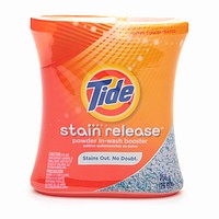
 The first one to grab my attention was actually a TIDE product, Powder in-Wash Booster 4-pack, but not for the same reasons as the rest of the line. Yes, this particular TIDE family member carried the bright orange palette, albeit a more interesting pattern, but it was the shape of it…oh, the shape of it, the way the shrink wrap hugged the bottles to form a waist invited me in to take the package off shelf and interact with it. I wanted to read the label and understand more about this particular TIDE product. In this aisle, TIDE cleaned up!
The next “stopper” was in the frozen section behind the glass where so many brands stand, as if nervously in line at an audition, waiting for the producers to take notice. After scanning the entire section, I came to a halt at the next-to-last glass door where a small, specialty brand named TABATCHNICK was peering out at me. The frozen entrée product imagery depicted on the front of each box was clear enough so I knew what I was buying, but what caught my eye was the basic serif font used in its logo. The letterforms were knocked-out to white against a field of black and created a wonderful block inside the glass. Taken out of context (i.e.: on a board in the client’s office) you could have debated the effectiveness of the overall design, or style of the appetite appeal in its ability to move product. But, in an audience of peers, this one stopped me and I took notice. TABATCHNICK landed the role.
The third and last “stopper” for this trip was located in the meat department. Now, in this store, you can approach the frozen burger aisle from left or right, or you can run straight into the display from the oral care aisle, which is a good 15 feet away. I happened to approach from the latter, after I finished checking out the mouthwash and toothbrushes. No doubt about it, my eyes zoomed right in on one brand only, BUBBA burgers. This brand was so obvious, so big and in my face (as probably BUBBA would be) that I had to force myself to look away from it to even take notice of its neighbors. The ginormous brand impression, helped by the big, red logotype on the light background (not to mention the name alone makes me, which is another great study in nomenclature) made this package jump off the shelf. You’d have had to blindfold me to not take notice. Well done, BUBBA!
So, I invite you to go on your own shopping trip, but as a consumer, not a CPG professional. I think you’ll be surprised as to which brands might stop YOU! Bummer though, if only some bun, ketchup, and pickle brands stopped me, I could be woofin’ down a BUBBA burger right now! Oh well, perhaps on my next spree.
Tide Website
Tabatchnick Website
Bubba Burgers Website
