It’s been a while since Starbucks announced the logo change. We are now seeing that logo in action. New commercials have rolled out with the new logo, and new cups are rolling through inventories.
Despite the age of this particular news, this topic has remains to be one of the most popular topics on my blog. So, I thought it’s worth revisiting the topic of logos here for discussion.
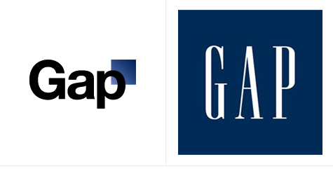
As with any change, many wanted no part of this logo change and called for the old logo to return. As some of you may remember, this particular change was also compared to Gap’s fail attempt to change their logo, and many was predicting the going-away of the new Starbucks logo. Of course, as we know now the Starbucks logo is here to stay. So, how does the new Starbucks logo work, whereas the Gap’s logo failed?

I knew the new Starbucks logo was here to stay. Why? Because it’s nothing like the change that Gap tried to make. There is updating the logo for relevance. Then there is changing the logo. The Gap incident was closer to the latter. Gap walked away from using blue as the fundamental look and feel to white. The little blue box in the now defunct new Gap logo was a nod to the original design, but it remained to be too far of a departure.

Some argued that the level of outcry depends on the level of brand loyalty. I have no doubt that there is great truth in this argument. However, one can’t possibly assert that a brand with high consumer loyalty can never updating their logo. Many brands have done so successfully. Pepsi for example. Per the New Coke experiment, we all know how loyal cola drinkers are. Nevertheless, Pepsi was able roll out their logo successfully, despite the always present dissenting opinion of a few. Pepsi’s logo an update of the old, and not a drastic departure in design.
Considering that the siren remained to be the hero of the new Starbucks logo, and despite going one-tone, Starbucks chose to stay with the iconic green that’s been in market since 1987. I think this logo will thrive. Nevertheless, this logo update, along with those done in the past, have taught us a few valuable lessons on logo and branding that we should not soon forget.
Photo Credit: Starbucks logos via Starbucks.com. Gap logos via cnn.com. Pepsi logos via bevreview.com ®/™ Trademarks owned by Starbucks Corporation, Gap, Inc, and Pepsi, Inc respectively.
